top of page


Badminton England
#BADMINTONIS
Print Ad Campaign
Date
2021
Client
Discipline
University Project,
Badminton England
Visual Identity, Graphic, Print, Advertising
Audience
People of all ages and abilities, Primarily people that do not play badminton.
Brief
Badminton England is the sport's governing body in England. It provides a structure for the sport from Board and Council, through to individual members and volunteers. Still there currently seems to be a lack of promotion for badminton in the UK.
Explore several possible routes for advertising campaigns in an effort to raise awareness of Badminton England and get more people interested in playing badminton.

Problem
Many people around the world have never watched or played badminton before due to the stereotype that badminton is a ‘weak’ ‘garden sport’. In order to introduce more people the the sport, that stereotype must be broken.
There is also a lack of funding involved in comparison to other sports resulting in less celebrity endorsement, meaning even less interest in the sport.

Solution
A print media ad campaign that highlights ways that badminton is powerful and exciting through the use of bold, eye catching typography and photography communicating the idea of movement and speed throughout.
The 'Badminton IS' campaign focuses on the high intensity nature of high level badminton, maximising cardio and calorie burn.
This Idea focuses on showing the powerful, intense, competitive side of badminton utilizing the words “Badminton Is” in conjunction with powerful adjectives describing badminton. These typographic posters can be combined with photography showing players in action shots.

Development
Throughout the research phase I would sketch down any ideas I had for shapes, features and forms primarily focusing on representing the phoenix.
It was difficult to try and capture the details of feathers and flames whilst also maintaining a simple design that would be visible when scaled down to small sizes.
I wanted to try designing a crest style logo based on falmouths official town crest. In order to to encorporate the castle turrets that feature in the actual crest I gave the top of the shield crenelations to symbolise castle battlements.
Another issue was finding a way to illustrate 2 heads without the anatomy looking wrong and distorted, But I felt that the double headed eagle from the falmouth crest was a central aspect of the branding and I didnt want to lose that element.


Photography
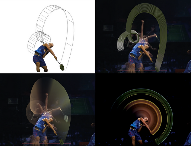
I needed the campaign photography to be clean and simple with the primary focus being on the badminton player, more specifically on the movement and shapes created by the various shots performed.
To emphasize and capture the idea of speed and motion in a still photograph, I utilised stroboscopic photography. This is used for photographing rapidly moving objects, capturing a motion blur effect for the entire duration of the movement.
This stroboscopical imagery is the main graphical element that ties the campaign together from the photography through to the typography.
I cropped and framed the final images using the golden spiral in order to create dynamic compositions whilst leaving negative space for logos and information.


Brand
Guidelines
After designing the logomark and jersey, the next step was to create clear brand guidelines in order to ensure a consistent, cohesive visual identity across all touchpoints.


bottom of page